
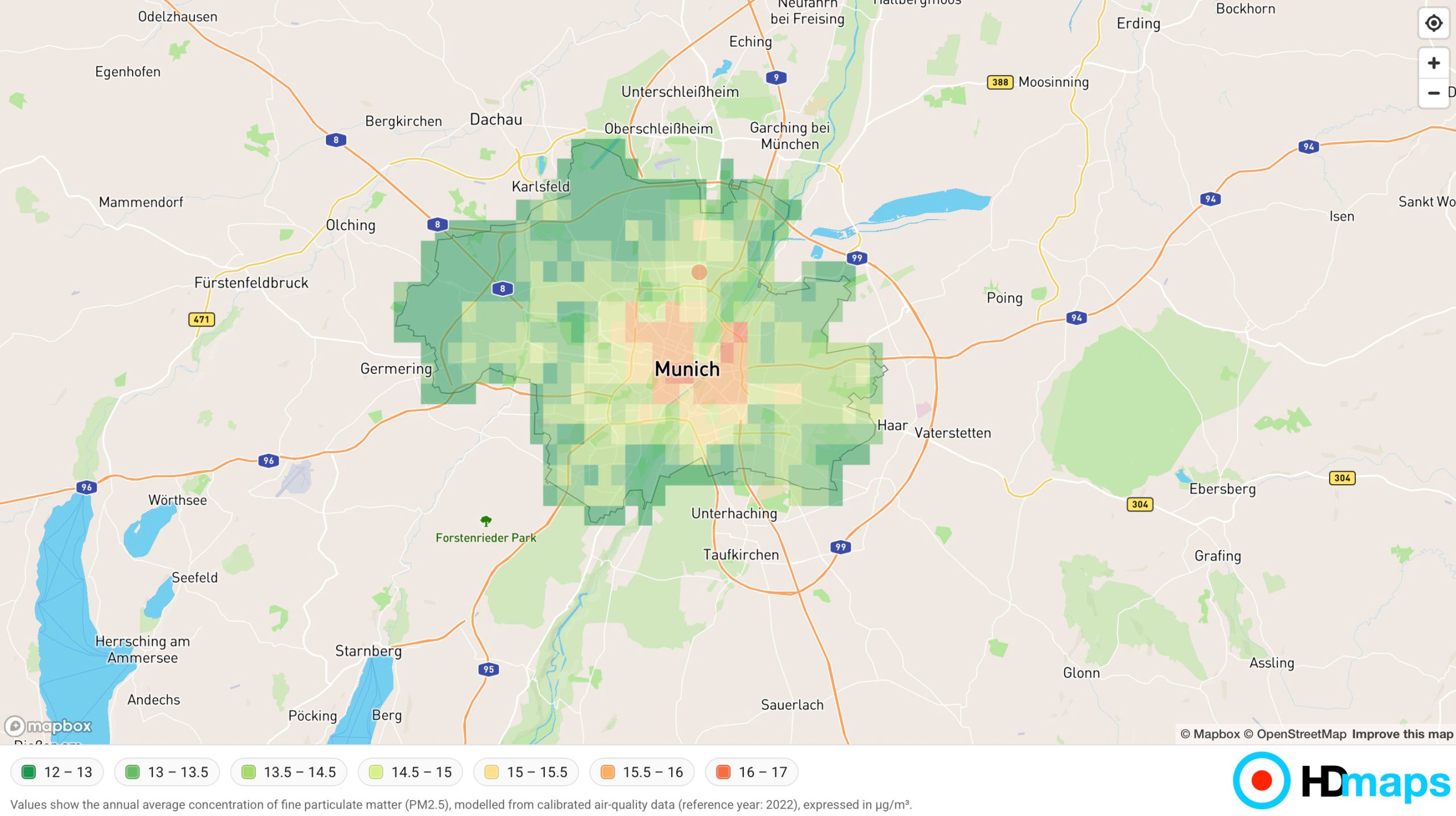
Understanding air quality is no longer optional—it is a critical factor in urban planning, real estate decisions, and public health awareness. With HDmaps, measuring and presenting air pollution becomes a seamless, visual, and actionable experience.
Turn Complex Data into Clear Visual Insight
HDmaps functions like a CSS layer for maps—a flexible framework that allows you to design, style, and present geospatial data exactly as needed. Whether you are working with pollution datasets, infrastructure data, or location-based insights, HDmaps enables you to transform raw information into intuitive, interactive visuals.
Air pollution data, often fragmented and difficult to interpret, can be unified into dynamic map layers. These layers can be overlaid with additional context such as Points of Interest (POIs), population density, or infrastructure networks, creating a comprehensive environmental perspective.
Dynamic Air Pollution Mapping—Anywhere You Need It
With HDmaps, air quality is not just displayed—it becomes part of a living, interactive experience:
- Embed fully interactive map widgets directly into your website or platform
- Export high-quality visuals for presentations, reports, or PDFs
- Combine multiple data layers (e.g. air pollution + traffic + population)
- Customize map styles to match your brand or analytical needs
This flexibility allows organizations to communicate environmental conditions clearly—whether to stakeholders, customers, or internal teams.
Want to see it live? Here it is!